Beauty From Bees
Facebook · Instagram · Messenger · Video
The ad
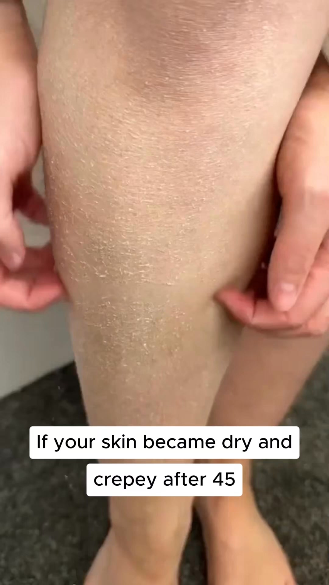
Ladies, are you noticing dryness and dullness on your body? Discover the ultimate natural solution for your body designed to deeply nourish and rejuvenate your skin. Expertly formulated to target dryness, our products restore essential hydration, leaving your skin firmer, smoother, and more radiant. No shortcuts, no compromises—just youthful, glowing skin that defies time.
The reason your skin turned crepey.
Shop nowThe funnel behind it
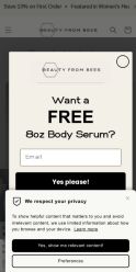
Offer: Body Serum - CA$32.00 (one-time purchase) or Subscribe & Save option available
Funnel score
8-point CRO breakdown
How well the landing page behind the ad is built to convert, scored across 8 factors: offer, copy, speed, trust, mobile, message-match, CTA, and social proof.
This page excels at building trust through extensive social proof (38,331 reviews, 5-star rating, media badges from ELLE and Good Housekeeping), detailed ingredient transparency, and a clear value proposition around natural, concentrated formulation. The headline is benefit-focused and the offer is transparent with subscription options. However, the page suffers from poor mobile optimization (text is cramped, layout doesn't adapt well), slow page speed (43/100), and a weak CTA button that lacks urgency or visual prominence. The message match is moderate—the ad emphasizes "crepey" skin and dryness, while the page focuses more on hydration and barrier repair without directly addressing the crepey skin concern. The popup modal for the free serum offer, while conversion-focused, interrupts the user experience.
What this funnel does right. Steal these.
- Social proof9/10
- Trust signals8/10
- Offer clarity8/10
- Headline7/10
Where it's weak
- Page speed4/10
- Mobile experience4/10
- Call to action5/10
Full breakdown
Call to action
5/10The 'Add to cart' button is present but lacks visual prominence, urgency language, or compelling design; it's a simple black button without contrast or persuasive copy.
- CTA button is clearly labeled 'Add to cart'
- Button is positioned logically after price and size selection
- Subscription option provides alternative CTA path
- Button lacks visual prominence—plain black on gray background
- No urgency language ('Shop now' from ad not used; 'Add to cart' is passive)
- No scarcity or time-limited messaging near CTA
Page speed
4/10Page speed score of 43/100 converts to approximately 4.3/10, indicating slow loading performance that will negatively impact user experience and conversion rates.
- PAGESPEED_SCORE of 43 indicates significant performance issues
- Slow load time will increase bounce rate and reduce conversions
- Multiple high-resolution product images and modal likely contribute to slowness
Trust signals
8/10Strong trust signals: 38,331 reviews with 5-star rating, media badges (ELLE, Good Housekeeping), detailed ingredient transparency with explanations, 30-day guarantee, free shipping threshold, and authentic customer testimonials with names and dates.
- 38,331 reviews with 5-star rating prominently displayed
- Media badges from ELLE and Good Housekeeping visible on product
- 30-day guarantee and free shipping ($125+) clearly stated
- No visible security badges or SSL certificate indicator
- Company background or 'About Us' information not visible on this page
Mobile experience
4/10Mobile optimization is poor: text is cramped and difficult to read, layout doesn't adapt well to narrow screens, product images and content stack awkwardly, and interactive elements (dropdowns, buttons) are not optimized for touch.
- Product image is visible and centered on mobile
- Price and rating are accessible without horizontal scrolling
- Navigation menu is collapsed into hamburger icon
- Body text is cramped and small, difficult to read on mobile screens
- Dropdown menus (scent, size) are not optimized for touch interaction
- Layout stacks vertically but doesn't adapt spacing or font sizes for mobile
Headline
7/10The headline 'Deeply Hydrates, Strengthening Your Skin's Barrier' is benefit-focused and clear, but generic and doesn't address the specific 'crepey' skin concern from the ad.
- Benefit-driven language ('Deeply Hydrates, Strengthening')
- Clear, readable typography in large font
- Positioned prominently above the fold
- Doesn't address 'crepey' skin mentioned in the ad
- Generic benefit language that could apply to many serums
- No urgency or emotional hook
Social proof
9/10Extensive social proof throughout: 38,331 reviews with 5-star rating displayed prominently, media badges (ELLE, Good Housekeeping), multiple customer testimonials with names and dates visible in lower sections.
- 38,331 reviews with 5-star rating shown directly under product name
- Two prestigious media badges (ELLE, Good Housekeeping) displayed on product image
- Multiple named customer reviews with dates and star ratings visible in lower sections
Message match
6/10Moderate alignment: ad emphasizes 'crepey' skin and dryness, page focuses on hydration and barrier repair; ad's 'Shop now' CTA doesn't match page's 'Add to cart'; ad's tone about 'youthful, glowing skin' is present but not dominant.
- Both ad and page emphasize natural ingredients and no compromises
- Hydration and skin rejuvenation themes present on both
- Target audience (women concerned with skin aging) is consistent
- Ad's specific 'crepey' skin concern not directly addressed on page headline
- Ad's 'Shop now' CTA doesn't appear on page; page uses 'Add to cart' instead
- Ad's emphasis on 'dryness and dullness' less prominent than page's 'barrier repair' focus
Offer clarity
8/10Price is clearly stated (CA$32.00), size options are visible (250ml/8oz), and subscription savings are shown, though the exact discount percentage requires clicking.
- Price prominently displayed: CA$32.00
- Size selector dropdown visible with 250ml/8oz option
- Subscription option shown with savings notation
- Exact subscription discount percentage not immediately visible without interaction
- Free shipping threshold ($125+) mentioned but not emphasized near price
More ads from Beauty From Bees
View all →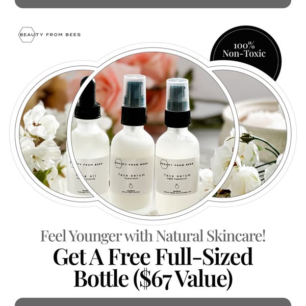 245dIMAGE
Get 1 FREE Full Sized 2 Oz Bottle of Face Oil ($67 Value)
 245dVIDEO
Get 1 FREE Full Sized 2 Oz Bottle of Face Oil ($67 Value)
 245dVIDEO
Get 1 FREE Full Sized 2 Oz Bottle of Face Oil
 245dIMAGE
Get 1 FREE Full Sized 2oz Bottle of Face Oil
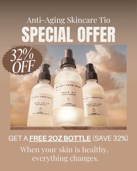 245dIMAGE
Get 1 FREE Full Sized 2oz Bottle of Face Oil
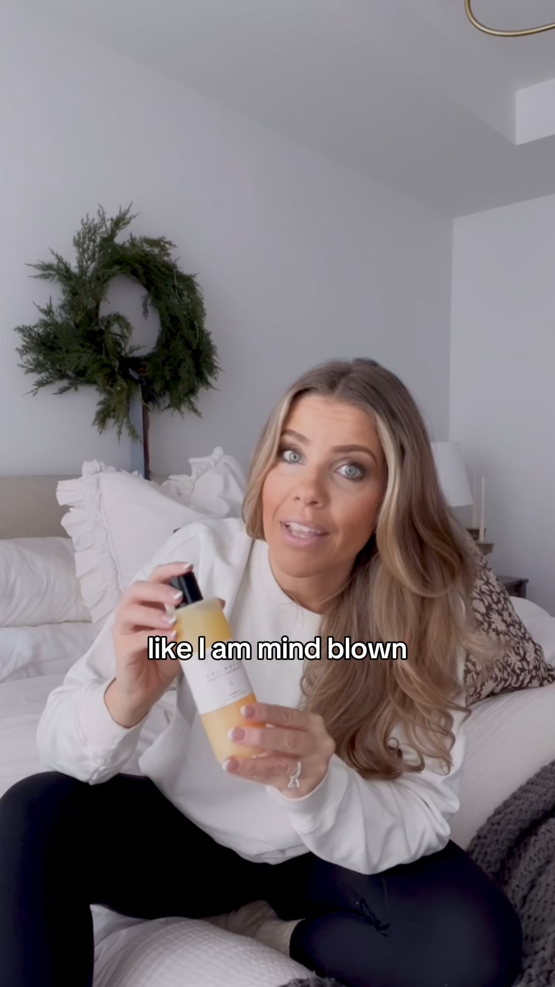 175dVIDEO
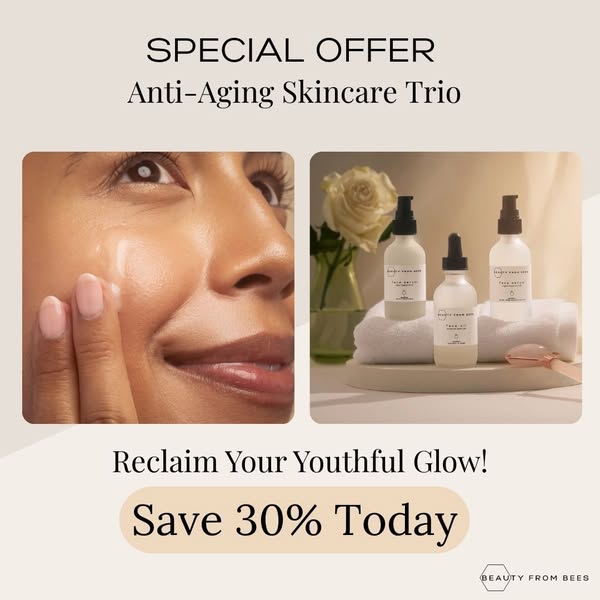
Anti-Aging Without the Irritation
Your own page
You just read somebody else's funnel. What does yours score?
The score above came from the real landing page behind this ad, graded on 8 CRO factors. Run your own page through the same rubric, free, and see what each factor found and where you give up the most ground.
Free, no signup, no card. The same 8 factor score every page here was graded on.
Keep exploring
Data from the public Meta Ad Library. Funnelens is not affiliated with or endorsed by Meta. See data sources.