Harry's
Facebook · Instagram · Messenger · Video
The ad
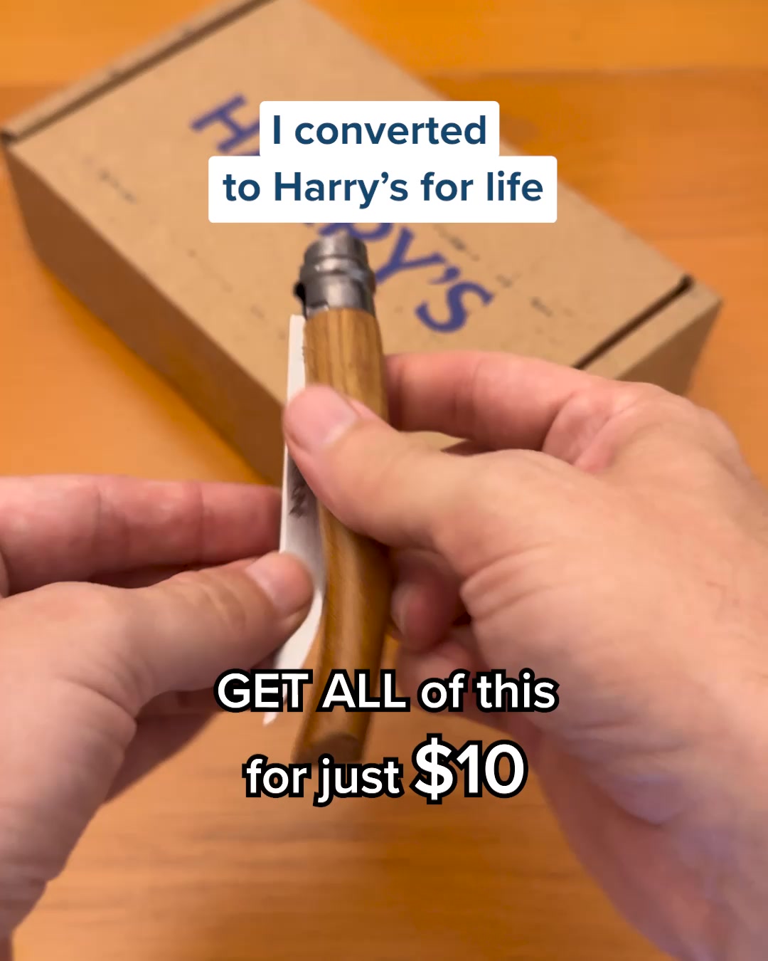
Harry's makes a well-crafted razor. We can’t help you master your craft, just your shave.
Master Your Shave.
Learn moreThe funnel behind it
Offer: Harry's Plus delivers our smoothest, most effortless glide.
Funnel score
8-point CRO breakdown
How well the landing page behind the ad is built to convert, scored across 8 factors: offer, copy, speed, trust, mobile, message-match, CTA, and social proof.
Harry's homepage does several things well: it has a clear value proposition ("smoothest, most effortless glide"), strong visual hierarchy with the hero product image, multiple CTAs, and substantial social proof (4,319 reviews on the Shave Gel, 2,905 on the Body Wash). However, it suffers from critical weaknesses. The page speed is severely compromised (30/100), which will hurt mobile experience and conversions. The headline "Upgrade Your Shave" doesn't match the ad's "Master Your Shave" messaging, creating disconnect. The primary CTA on the hero is "LEARN MORE" rather than a direct purchase button, adding friction. Trust signals are present but scattered (company story, factory info, help center) rather than prominently featured. The page tries to do too much—showing multiple product categories and razor options—which dilutes focus from the immediate conversion goal.
What this funnel does right. Steal these.
- Social proof7/10
- Offer clarity7/10
Where it's weak
- Page speed3/10
- Mobile experience4/10
- Message match4/10
- Headline5/10
Full breakdown
Call to action
6/10Multiple CTAs present but primary hero CTA is 'LEARN MORE' (soft) rather than direct purchase, with 'SHOP NOW' as secondary button.
- Two prominent orange buttons in hero section create clear visual hierarchy
- High contrast orange color stands out against blue background
- Multiple CTAs throughout page (SHOP NOW appears 3+ times) provide conversion opportunities
- Primary CTA is 'LEARN MORE' instead of direct purchase action, adding friction
- No urgency language (e.g., 'Limited time', 'Subscribe now') on CTAs
- CTA text doesn't match ad CTA ('Learn more' vs 'LEARN MORE'—capitalization differs)
Page speed
3/10Page speed score of 30/100 is critically poor; converted to 0-10 scale this is approximately 3/10, indicating severe performance issues.
- PAGESPEED_SCORE of 30/100 indicates critical performance problems
- Multiple high-resolution product images throughout page will load slowly
- Heavy JavaScript likely required for carousels and interactive elements
Trust signals
6/10Trust elements exist (company story, factory info, help center, social media links) but are relegated to footer; no prominent security badges, guarantees, or founder credibility in hero section.
- Company story visible in lower section: 'Jeff and Andy thought men deserved a great shave'
- Help Center link and email (help@harrys.com) provided in footer
- Social media links (Instagram, TikTok) visible at bottom for brand verification
- No security badges, SSL indicators, or payment trust signals visible above fold
- No money-back guarantee or return policy mentioned in hero section
- Trust-building content (company story, factory info) buried in footer, not prominent
Mobile experience
4/10Page layout appears responsive but severe performance issues (30/100 speed score) will cripple mobile experience; text and buttons are readable but page load will be painfully slow.
- Text is readable and appropriately sized for mobile viewing
- Orange buttons are large enough for touch targets
- Navigation menu is accessible via hamburger icon
- Catastrophic page speed (30/100) will cause mobile abandonment
- Multiple high-resolution product images will load slowly on mobile networks
- Carousel sections (Best Sellers, Shop By Category) require interaction, adding friction on mobile
Headline
5/10The headline 'Upgrade Your Shave' is generic and doesn't match the ad's 'Master Your Shave' messaging, creating cognitive disconnect.
- Clear and readable typography in large font
- Positioned prominently above the fold
- Action-oriented verb ('Upgrade')
- Doesn't match ad headline 'Master Your Shave'—creates message mismatch
- Generic language ('Upgrade') lacks differentiation or specific benefit
- No mention of the product (Harry's Plus) in the headline itself
Social proof
7/10Multiple star ratings and review counts visible (4,319 reviews on Shave Gel, 2,905 on Body Wash) but scattered across product cards rather than prominently featured.
- 4,319 five-star reviews on Shave Gel 6.7oz product card
- 2,905 five-star reviews on Stone Body Wash 18oz product card
- Star ratings displayed visually with gold stars for easy scanning
- Social proof only appears in Best Sellers section, not in hero/above fold
- No customer testimonials or quotes visible
- No trust badges, certifications, or company credentials in prominent locations
Message match
4/10Significant mismatch between ad messaging and page content: ad says 'Master Your Shave' but page says 'Upgrade Your Shave'; ad emphasizes craft but page emphasizes product features.
- Page does feature Harry's razors prominently, matching ad's product focus
- Hero product image matches the razor shown in ad
- Page is on harrys.com, correct brand destination
- Headline mismatch: ad says 'Master Your Shave' but page says 'Upgrade Your Shave'
- Ad primary text about 'well-crafted razor' doesn't appear on page
- Page focuses on product benefits (glide, smoothness) rather than craftsmanship angle from ad
Offer clarity
7/10The offer is stated clearly ('smoothest, most effortless glide') but buried below the fold in product listings; the hero section lacks specific offer details like pricing or subscription benefits.
- Specific benefit claim: 'smoothest, most effortless glide' in hero section
- Product prices visible ($6 for Shave Gel, $8 for Body Wash) in Best Sellers section
- Clear product differentiation between Harry's Plus and Harry's Original
- No pricing or offer details in the hero section above the fold
- Subscription benefit mentioned in top banner but not explained on page
- Multiple competing offers (razors, gels, body wash) dilute focus from primary offer
More ads from Harry's
View all → 172dVIDEO
Introducing Black Lip Balm
 172dVIDEO
Depuff Your Face with Harry's New Product
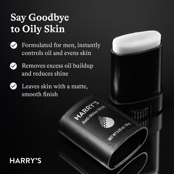 172dIMAGE
Tired of Greasy, Shiny Skin?
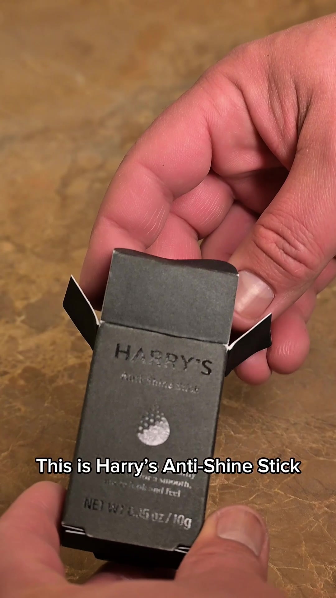 172dVIDEO
Tired of Greasy, Shiny Skin?
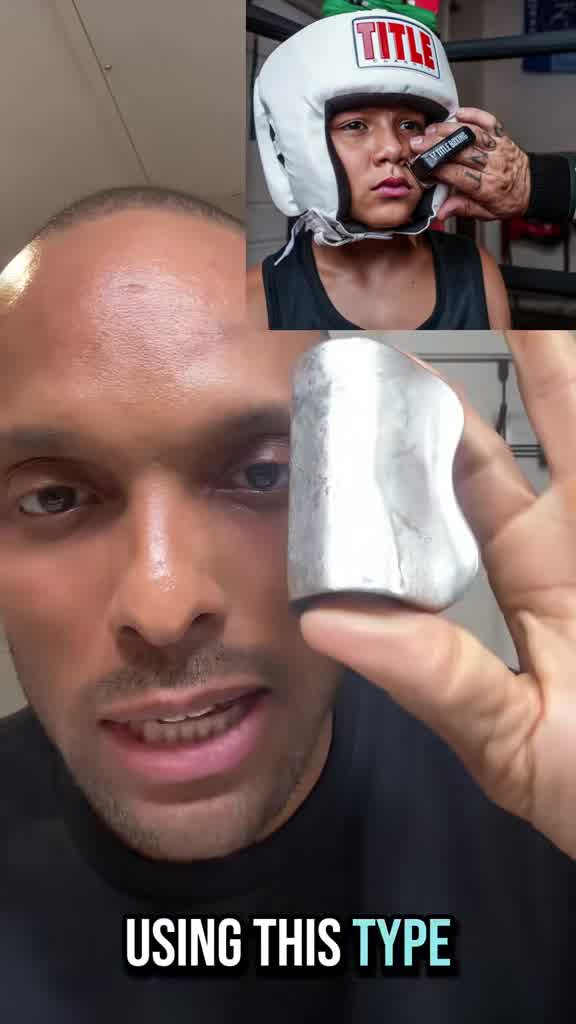 172dVIDEO
Depuff Your Face with Harry's New Product
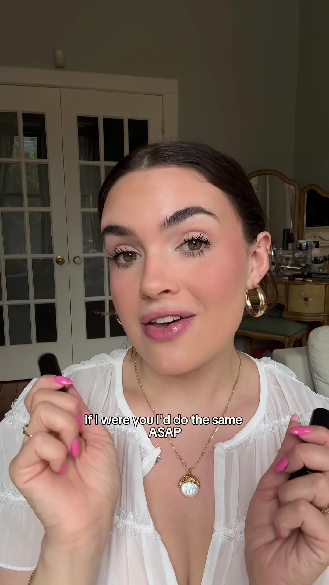 172dVIDEO
Introducing Black Lip Balm
Your own page
You just read somebody else's funnel. What does yours score?
The score above came from the real landing page behind this ad, graded on 8 CRO factors. Run your own page through the same rubric, free, and see what each factor found and where you give up the most ground.
Free, no signup, no card. The same 8 factor score every page here was graded on.
Keep exploring
Data from the public Meta Ad Library. Funnelens is not affiliated with or endorsed by Meta. See data sources.