Harry's
Facebook · Instagram · Audience Network · Video
The ad
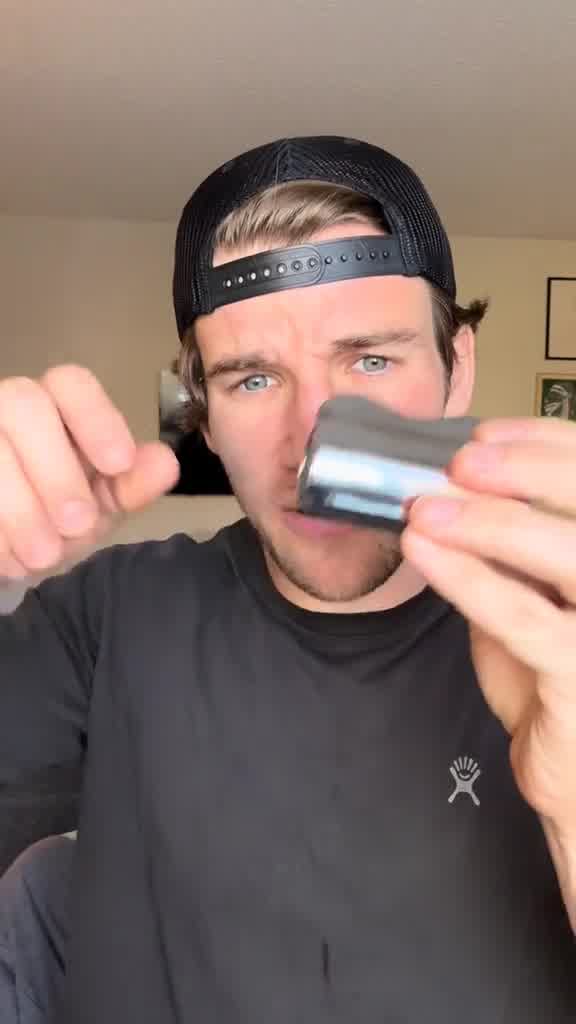
Say goodbye to puffy, tired-looking eyes with our Cooling Eye Kit!
Depuff Your Face with Harry's New Product
Learn moreThe funnel behind it
Offer: Cooling Eye Kit | $28
Funnel score
8-point CRO breakdown
How well the landing page behind the ad is built to convert, scored across 8 factors: offer, copy, speed, trust, mobile, message-match, CTA, and social proof.
This product page excels at social proof with 391 verified reviews (4.1 stars), award badges, and customer testimonials prominently displayed. The offer is crystal clear with transparent pricing ($28), included components, and a complete routine bundle option. However, the page suffers from poor mobile optimization—the layout appears cramped and navigation is cluttered on smaller screens. Page speed is critically slow (31/100), which severely impacts user experience. The headline is descriptive but generic, and while the CTA is prominent, the page could better emphasize the depuffing/tired-eye benefit that the ad promises. Trust signals are strong (verified buyers, quality guarantee, free shipping threshold), but speed and mobile experience are significant conversion killers.
What this funnel does right. Steal these.
- Social proof9/10
- Offer clarity9/10
- Call to action8/10
- Trust signals8/10
Where it's weak
- Page speed3/10
- Mobile experience4/10
Full breakdown
Call to action
8/10Primary CTA 'ADD TO CART' is large, orange, and highly visible; secondary CTA 'ADD TO CART' appears again in the routine bundle section, reinforcing the action.
- Large orange 'ADD TO CART' button is prominent and contrasts well with page background
- CTA appears twice (product level and routine bundle), giving multiple conversion opportunities
- Quantity selector directly above CTA makes it easy to adjust before adding
- CTA text doesn't match ad CTA ('Learn more' in ad vs 'ADD TO CART' on page), creating slight message disconnect
Page speed
3/10PAGESPEED_SCORE of 31 is critically slow; converted to 0-10 scale (31/100 ≈ 3/10), indicating severe performance issues that will hurt conversion rates.
- PAGESPEED_SCORE of 31/100 indicates very slow load times
- Multiple high-resolution product images and review photos likely contribute to slow performance
- Slow speed will increase bounce rate and reduce mobile conversions
Trust signals
8/10Strong trust signals: 391 verified reviews, 4.1-star rating, two award badges, 'Best Seller' label, free shipping threshold ($30), Quality Guarantee, and verified buyer badges on reviews.
- 391 verified reviews with 4.1-star rating and detailed breakdown (239 5-star, 53 4-star, etc.)
- Two award badges (Grooming Awards 2024, Recommended 2024) visible on product
- Free shipping for orders over $30 and Quality Guarantee displayed below product image
Mobile experience
4/10Mobile layout is cramped and cluttered; navigation menu is compressed, product images are small, and the routine bundle section is difficult to parse on small screens.
- Quantity selector and ADD TO CART button are accessible and tappable
- Product images are visible and can be swiped through
- Hamburger menu and search icon are cramped in header, reducing usability
- Product description text is small and dense, hard to read on mobile
- Routine bundle section with three products and pricing is visually cluttered on narrow screens
Headline
6/10Headline is descriptive but generic; it names the product and price but doesn't emphasize the key benefit (depuffing/tired eyes) that the ad promises.
- Clear product name and price
- Includes 'Best Seller' badge for credibility
- Doesn't lead with the depuffing/tired-eye benefit mentioned in the ad
- Lacks emotional appeal or urgency
- Generic product-name-plus-price format
Social proof
9/10Extensive social proof throughout: 391 verified reviews with 4.1-star rating, two award badges (Grooming Awards 2024, Recommended 2024), customer testimonials, and verified buyer reviews with recent timestamps.
- 391 verified reviews with 4.1-star rating displayed prominently under headline
- Two award badges (Grooming Awards 2024, Recommended 2024) visible on product image
- Multiple verified customer reviews with names, photos, and recent timestamps (8 hours ago, 3 days ago, 1 week ago)
Message match
6/10Ad promises 'Say goodbye to puffy, tired-looking eyes' and 'Depuff Your Face,' but page headline is generic product name; benefits are explained in body copy, not emphasized in headline.
- Page does address depuffing: 'Instantly soothes and reduces appearance of under-eye puffiness' in benefits section
- Product description mentions 'hydrate and calm for a refreshed look'
- Ad CTA is 'Learn more' but page goes straight to 'ADD TO CART,' showing intent alignment
- Ad headline 'Depuff Your Face' doesn't appear in page headline
- Page headline is generic product name, not benefit-driven like the ad
- Ad CTA 'Learn more' doesn't match page CTA 'ADD TO CART'
Offer clarity
9/10Price ($28), what's included (Cooling Eye Stick, Facial Massage Tool, travel case), and benefits are all explicitly stated with no ambiguity.
- Price clearly displayed at top: $28
- Kit contents shown visually with product images and labeled components
- Detailed bullet points explaining what the kit does and includes
More ads from Harry's
View all →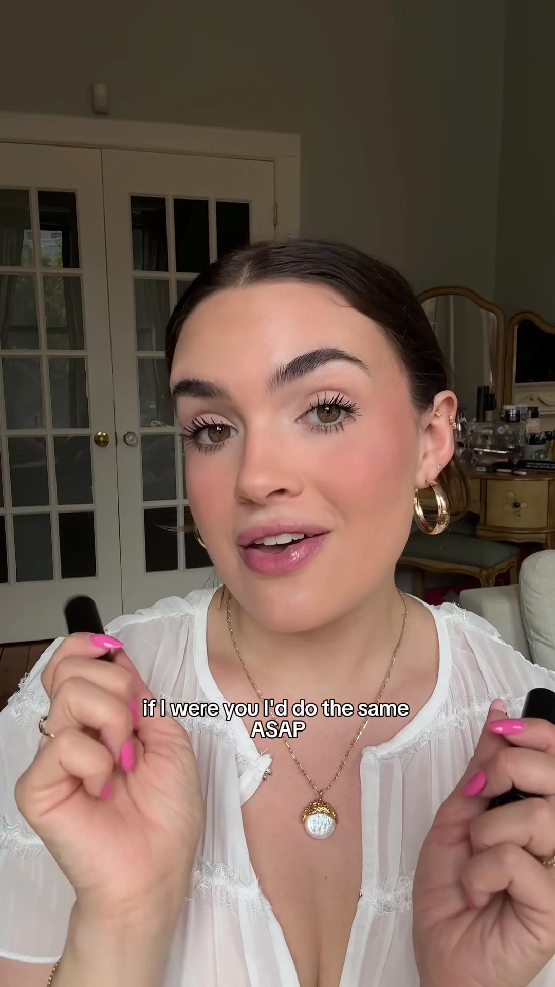 172dVIDEO
Introducing Black Lip Balm
 172dVIDEO
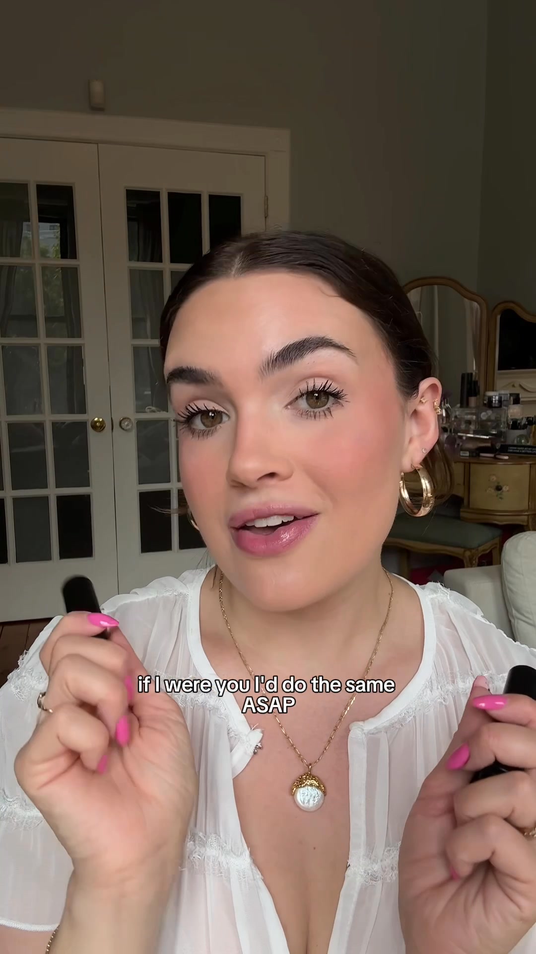
Introducing Black Lip Balm
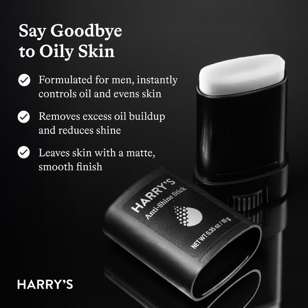 172dIMAGE
Tired of Greasy, Shiny Skin?
 172dVIDEO
Tired of Greasy, Shiny Skin?
 172dVIDEO
Depuff Your Face with Harry's New Product
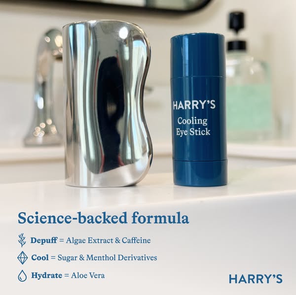 172dIMAGE
Depuff Your Face with Harry's New Product
Your own page
You just read somebody else's funnel. What does yours score?
The score above came from the real landing page behind this ad, graded on 8 CRO factors. Run your own page through the same rubric, free, and see what each factor found and where you give up the most ground.
Free, no signup, no card. The same 8 factor score every page here was graded on.
Keep exploring
Data from the public Meta Ad Library. Funnelens is not affiliated with or endorsed by Meta. See data sources.