Beauty From Bees
Facebook · Instagram · Messenger · Video
The ad
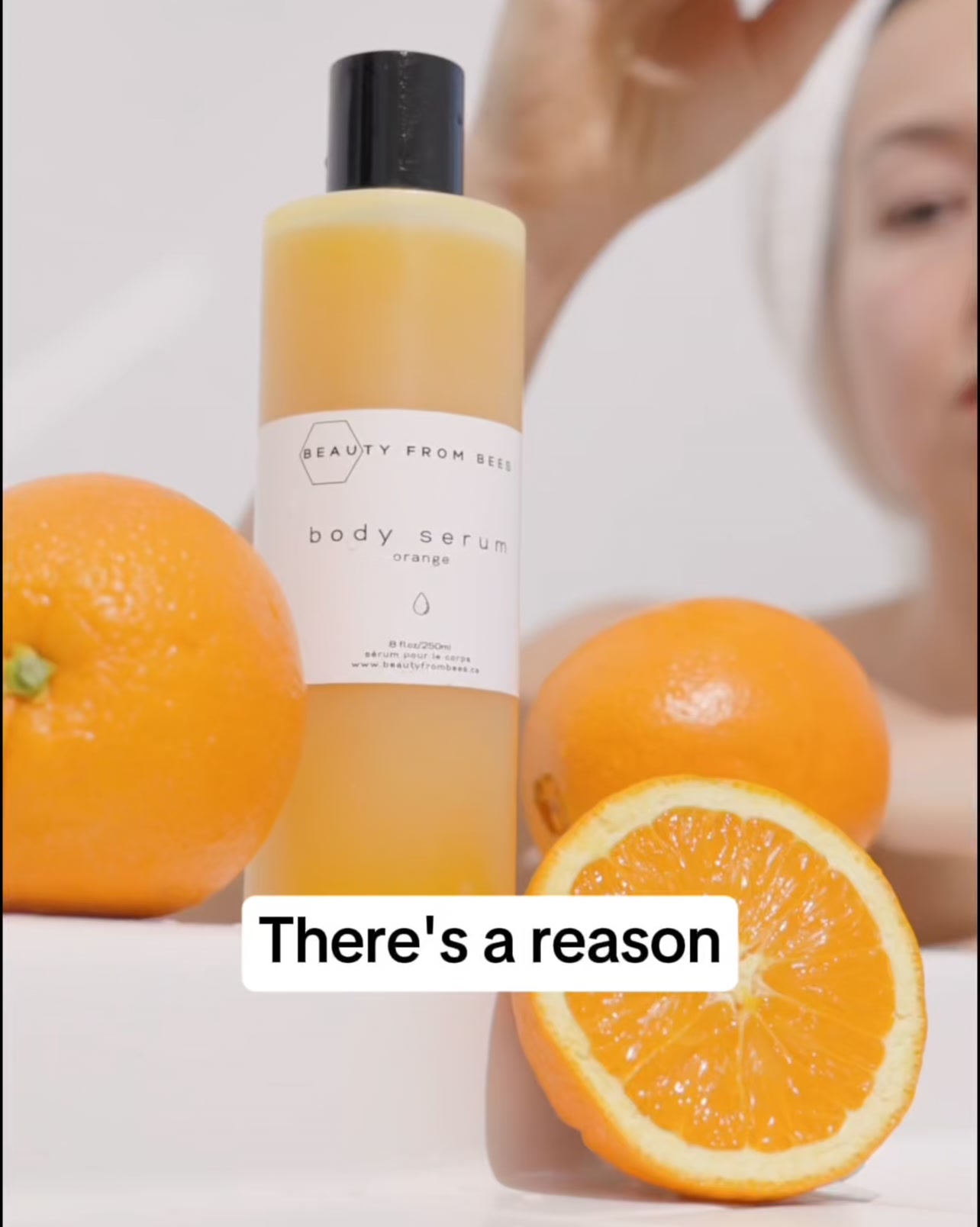
Ladies, are you noticing dryness and dullness on your body? Discover the ultimate natural solution for your body designed to deeply nourish and rejuvenate your skin. Expertly formulated to target dryness, our products restore essential hydration, leaving your skin firmer, smoother, and more radiant. No shortcuts, no compromises—just youthful, glowing skin that defies time.
Confident. Glowing. Unstoppable.
Shop nowThe funnel behind it
Offer: Body Serum - CA$32.00 (One-time purchase) or Subscribe & Save at CA$28.80
Funnel score
8-point CRO breakdown
How well the landing page behind the ad is built to convert, scored across 8 factors: offer, copy, speed, trust, mobile, message-match, CTA, and social proof.
This page excels at building trust through extensive social proof (38,331 reviews, 5-star rating, multiple award badges from ELLE and Good Housekeeping), detailed ingredient transparency, and a clear value proposition around natural, concentrated formulation. The headline directly addresses the core benefit (hydration and barrier strengthening) matching the ad's focus on dryness and nourishment. However, the page suffers from severe performance issues (PageSpeed 32/100), a somewhat buried primary CTA that requires scrolling past multiple sections, and a cluttered mobile experience with competing offers (free serum promotion, subscription option). The offer clarity is good but slightly diluted by multiple purchasing options presented simultaneously. The popup modal offering a free 8oz serum, while potentially effective for email capture, interrupts the purchase flow and creates message confusion.
What this funnel does right. Steal these.
- Trust signals9/10
- Social proof9/10
- Headline8/10
- Message match8/10
- Offer clarity7/10
Where it's weak
- Page speed3/10
- Mobile experience5/10
Full breakdown
Call to action
6/10Primary CTA 'Add to cart' is present but requires scrolling past product details, and is visually competing with secondary CTAs from the popup modal and special offer section.
- Black 'Add to cart' button is high-contrast and visible
- CTA appears after key product information and benefits
- Trust signals (30-Day Guarantee, Free Shipping, Made in Canada) appear directly above CTA
- CTA requires scrolling past multiple sections to reach from top of page
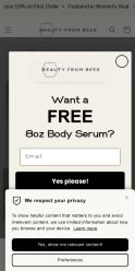
- Popup modal with 'Yes please!' CTA interrupts the primary conversion path
- Secondary 'Free Body Serum' offer with its own CTA competes for attention lower on page
Page speed
3/10PageSpeed score of 32/100 indicates severe performance issues that will significantly impact user experience and conversion rates, particularly on mobile.
- PageSpeed score 32/100 is critically low (converted from 0-10 scale: ~3.2)
- Likely causes: unoptimized images, render-blocking resources, or excessive JavaScript
- Slow load times will increase bounce rate and reduce mobile conversions
Trust signals
9/10Exceptional trust-building through multiple credibility signals: award badges, 38K+ reviews, detailed ingredient transparency, clear brand promise, satisfaction guarantee, and authentic customer testimonials with names and dates.
- Award badges from ELLE and Good Housekeeping in hero section
- 38,331 verified reviews with 5-star rating
- Detailed customer testimonials with names, dates, and specific benefits mentioned
Mobile experience
5/10Mobile layout is functional but cramped, with stacked elements, small touch targets, and the popup modal taking up excessive screen real estate on small screens.
- Navigation menu accessible via hamburger icon
- Product image scales to mobile viewport
- Key information (price, rating, size selector) visible without excessive scrolling
- Popup modal is oversized relative to mobile screen, difficult to dismiss
- Multiple dropdown selectors (scent, size) require precise tapping on small screens
- Subscription option and one-time purchase radio buttons are small and close together
Headline
8/10Headline 'Deeply Hydrates, Strengthening Your Skin's Barrier' directly addresses the ad's core promise of nourishment and hydration for dryness.
- Matches ad messaging about hydration and skin restoration
- Specific benefit-driven language (hydrates, strengthens barrier)
- Positioned prominently above product image
- Somewhat generic skincare language that doesn't differentiate
- Doesn't emphasize the 'natural' or 'concentrated' angle as strongly as body copy does
Social proof
9/10Exceptional social proof with 38,331 reviews at 5-star rating, plus two prestigious award badges (ELLE, Good Housekeeping) and multiple detailed customer testimonials visible throughout the page.
- 38,331 reviews with 5-star rating displayed prominently under product name
- Two award badges (ELLE, Good Housekeeping) visible in product hero section
- Multiple named customer reviews with dates and star ratings (Lindsey Dwell, Jeri Pero-Fraser, Jenn Mcnab) with detailed testimonials
Message match
8/10Strong alignment between ad messaging (dryness, nourishment, hydration, natural solution, youthful glowing skin) and page content (hydration focus, natural ingredients, barrier repair, multiple benefit callouts).
- Ad's 'dryness and dullness' directly matched by page's 'Deeply Hydrates' headline
- Ad's 'natural solution' matched by page's '100% Natural' callout and ingredient transparency
- Ad's 'firmer, smoother, more radiant' matched by page benefits: Barrier Repair, Silky Not Greasy, Soothing Irritation
- Ad headline 'Confident. Glowing. Unstoppable.' is more aspirational than page's functional benefit focus
- Page emphasizes 'concentrated ingredients' more than ad's 'expertly formulated' language
Offer clarity
7/10Price is clear (CA$32.00) with subscription option visible, but multiple purchasing paths (one-time, subscribe & save, free serum offer) create slight confusion about the primary offer.
- Price prominently displayed: CA$32.00
- Size option clearly shown: 250ml/8oz dropdown
- Subscription savings explicitly stated: CA$28.80 vs CA$32.00
- Free body serum popup modal competes with main offer
- Multiple CTAs (Add to cart, Yes please!, No thanks) dilute focus
- Special offer section lower on page creates secondary offer confusion
More ads from Beauty From Bees
View all →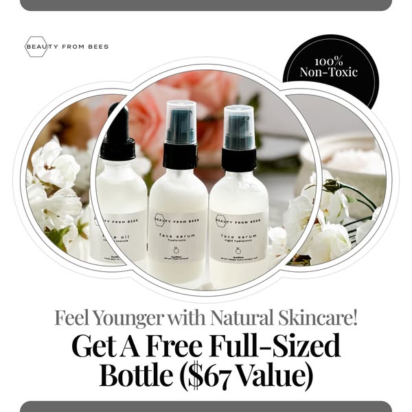 245dIMAGE
Get 1 FREE Full Sized 2 Oz Bottle of Face Oil ($67 Value)
 245dVIDEO
Get 1 FREE Full Sized 2 Oz Bottle of Face Oil ($67 Value)
 245dIMAGE
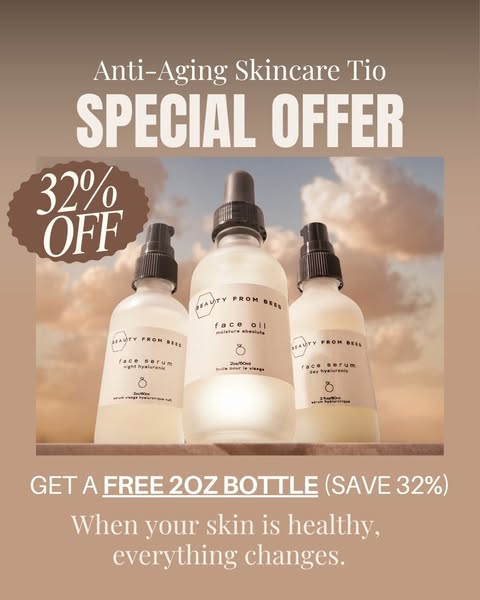
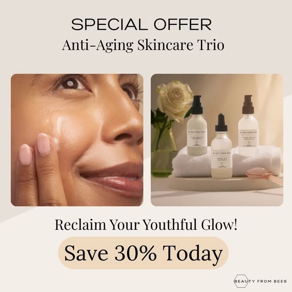
Get 1 FREE Full Sized 2oz Bottle of Face Oil
 245dIMAGE
Get 1 FREE Full Sized 2oz Bottle of Face Oil
 245dVIDEO
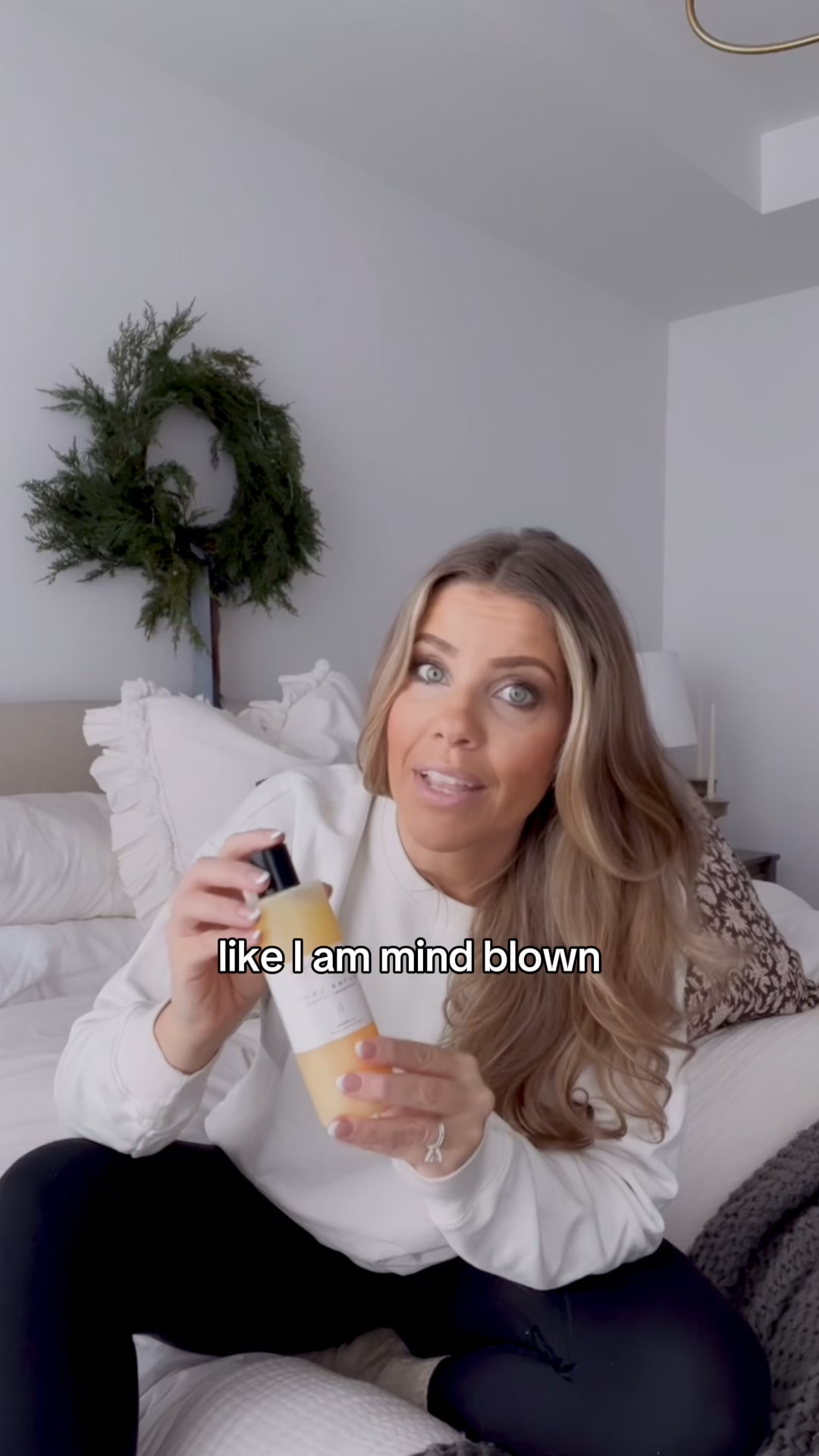
Get 1 FREE Full Sized 2 Oz Bottle of Face Oil
 175dVIDEO
Anti-Aging Without the Irritation
Your own page
You just read somebody else's funnel. What does yours score?
The score above came from the real landing page behind this ad, graded on 8 CRO factors. Run your own page through the same rubric, free, and see what each factor found and where you give up the most ground.
Free, no signup, no card. The same 8 factor score every page here was graded on.
Keep exploring
Data from the public Meta Ad Library. Funnelens is not affiliated with or endorsed by Meta. See data sources.